

By Sam Eady, Head of Research at Wrapped Agency
Headings do more than just break up a page visually. They help show how content is organised and make it easier for people to understand what they are looking at.
That matters for accessibility because a clear heading structure helps users scan content, find information faster, and understand how different sections fit together.
Why it matters
For many people, headings make content easier to follow, breaking information into manageable sections and making longer pages feel less overwhelming.
They are especially important for people using screen readers, who may use headings to move through a page and jump straight to the sections they need.
So headings are not just a formatting choice. They are an important part of making digital content easier to use.
This is particularly important for healthcare websites, where patients need to find information about services, treatments and appointments quickly, and for charity websites, where supporters may be looking for ways to donate, volunteer or access support. Financial services websites also need to make complex information easy to navigate, while property websites often contain detailed information about developments, locations and buying options. A clear heading structure helps people find the information that’s relevant to them, regardless of how they access the website.
Clear heading structure can also help search engines understand the content of a page more clearly, making it good practice from both an accessibility and SEO point of view.
What often goes wrong
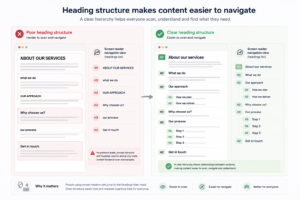
Problems usually happen when headings are used just to make text look bigger or bolder, instead of showing the actual structure of the content.
Common issues include:
- skipping heading levels
- using headings for styling only
- missing headings on longer pages
- using vague or repetitive section titles
- creating a structure that does not match the content underneath
All of this can make content harder to scan, navigate, and understand.
What better looks like
A good heading structure should be clear, logical, and consistent.
For example, a healthcare website might use an H1 for “Physiotherapy Services”, H2 headings for “Conditions We Treat”, “Our Treatments” and “Book an Appointment”, and H3 headings for individual treatments within those sections. This creates a logical structure that helps people using screen readers navigate the page and makes the relationship between different sections clearer.
That means using headings to reflect the hierarchy of the content, keeping section titles descriptive, and making sure each heading matches the content that follows.
When headings are used well, they help people move through a page more easily and understand the content with less effort.
Better structure, better usability
Clear heading structure supports accessibility, but it also improves usability more broadly.
When content is organised well, people are more likely to find what they need, stay engaged, and understand the message more easily.
If you would like further guidance on creating more accessible and user-friendly digital content, the team at Wrapped Agency can help.